
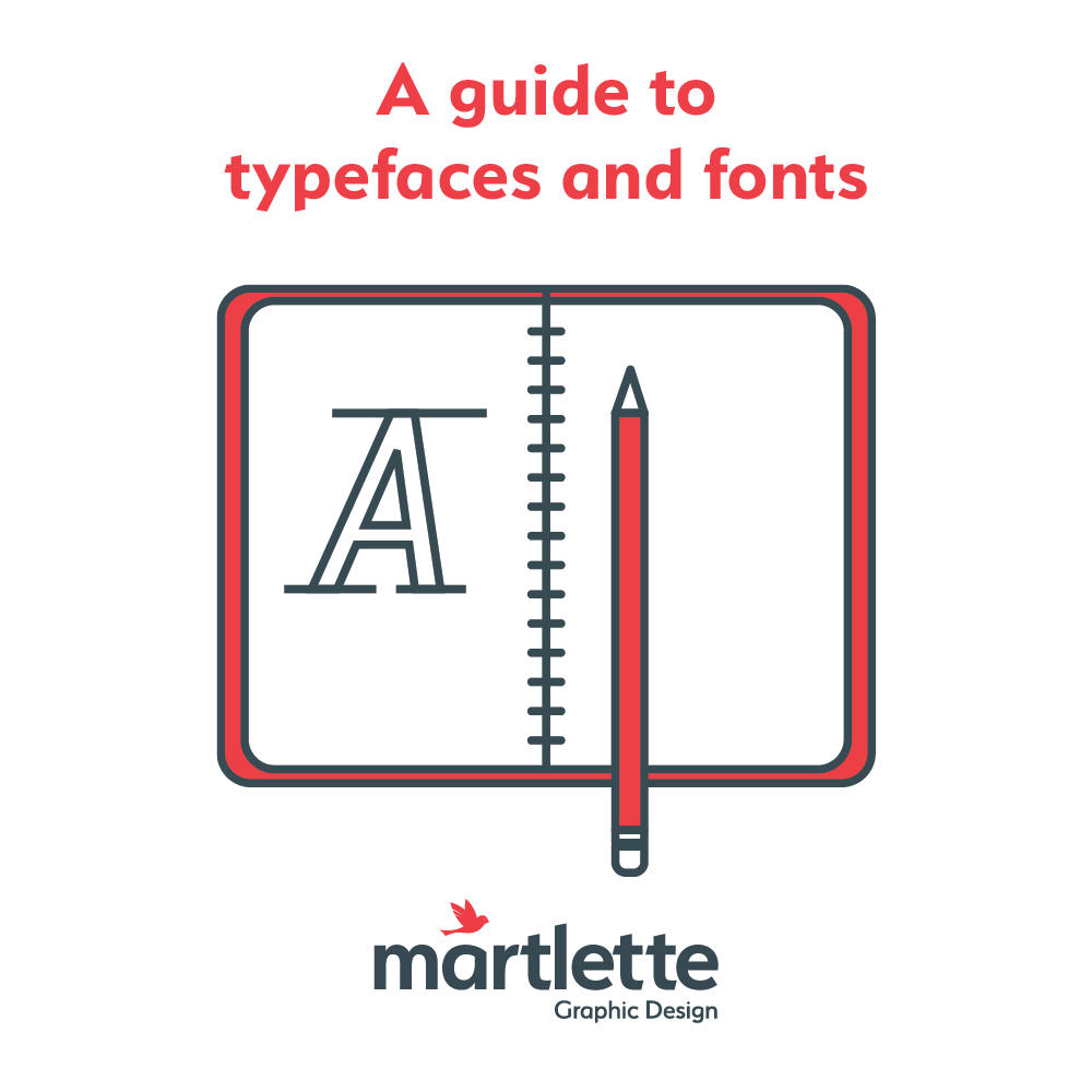
The words ‘font’ and ‘typeface’ are often used interchangeably, but mean different things to your average graphic designer.
A typeface is the creative design of lettering and symbols in a particular style or theme. A font is the vehicle that delivers this artwork to your desktop for use.
Your logo artwork files provided by your graphic designer should include a Style Guide for you to reference when needing guidance on using your logo artwork and associated typefaces. Details about the font used to create your logo and guidance on what secondary fonts should used, may also be included.
To avoid overcrowding the look of your document layout, try not to over use typefaces or choose too many different styles in the one document.
Typeface designs are generally divided into four broad categories as shown on below.

DISPLAY FONTS are ideal for headings, large bold statements and for logos where only a few words are being used. Display fonts will typically not be used in paragraphs of text and will not be easy to read. At the very most, a display font may be used as a tagline to accompany a logo.

TEXT FONTS are what you would use for large amounts of copy in a document or book. Text fonts are far easier on the eye and are usually freely available on your desktop computer. Common examples of great text fonts are Arial or Helvetica.

SERIF TYPEFACES have the ‘little feet’ at the base of some letters. A popular example is Times New Roman, where you can see the serifs join together to form a base line, which is what makes a serif typeface so easy for the reader to glide their eye over.

SANS SERIF TYPEFACES do not have the ‘little feet’ and whilst they are not widely used for large amounts of text in hard copy books, Sans Serif Typefaces are commonly used for headings and paragraphs of text on websites, as they can appear more clearly on desktop and mobile screens.